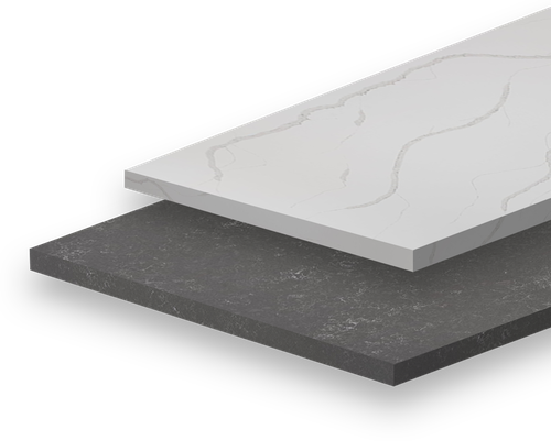
August 13, 2020
Light Quartz vs. Dark Quartz- What is Right for You ?

The kitchen is arguably the most important room in the house and a room that certainly draws a lot of appeal to potential homebuyers. During a renovation there are a lot of decisions to be made-from cabinet colours to appliances, lighting fixtures and of course countertops, it can be easy to become overwhelmed. Quartz kitchen countertops come in a variety of different colours, patterns and textures, so this raises the question, how do I know what colour of quartz I should go with? While there are many factors that play into this decision, today we are going to explore the differences between light and dark quartz colours, and help you decided which one will better suit your design aesthetic and lifestyle.
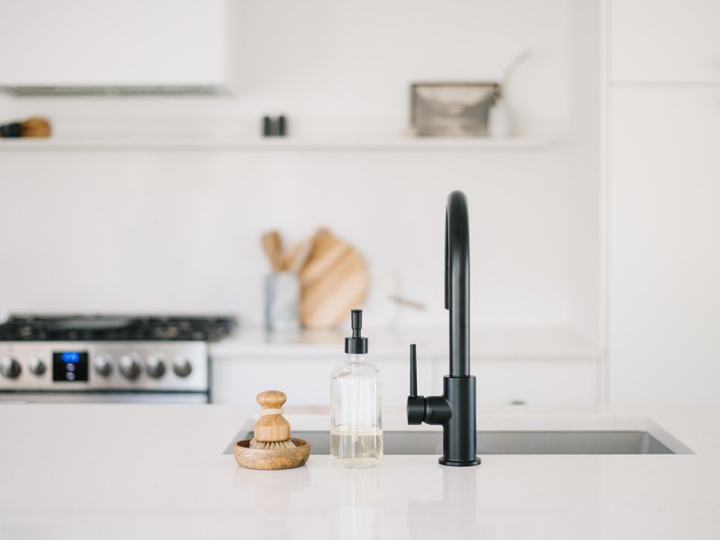
Colour Featured: Whistler
Over the past few years, there has been a strong tendency for people to select lighter quartz countertops, favouring various shades of white and light grey. There are many advantages to choosing lighter kitchen countertops. For one, they will brighten up your space, ultimately making it feel more inviting. Because light countertops air more on the neutral side, they also complement a number of different design styles allowing you more freedom to play with colour in your space. HanStone Quartz offers a wide range of options when it comes to selecting your quartz countertops. From plain bright white or white with subtle veining to something more dramatic with lots of movement, there will undoubtedly be a colour that suits your taste.
This year we have seen a lot of diversity in terms of kitchen cabinet colours and backsplash ideas. People are finally embracing colour and we couldn’t be more excited. While solid or more muted countertops can look simple on their own, when paired with bright coloured cabinetry or a more intricate backsplash they can balance the space beautifully. Softly veined quartz countertops have a timeless appeal. Some of our favourite HanStone colours are Montauk, Chantilly and Strato.
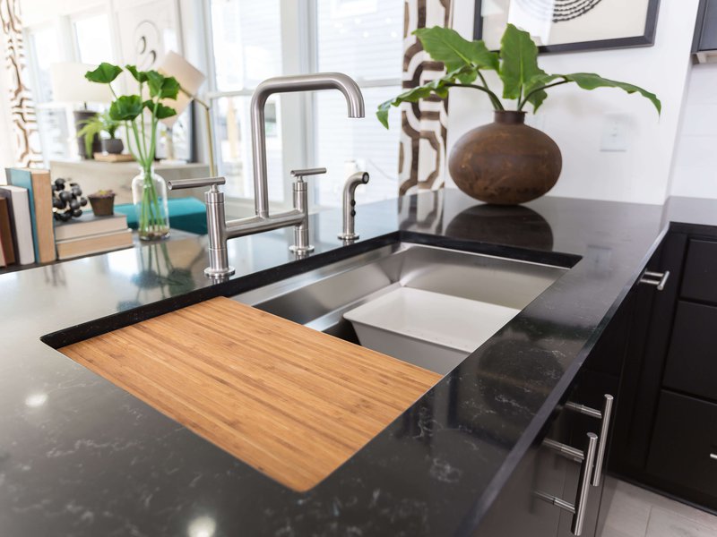
Colour Featured: Silhouette
Dark countertops are having a major moment this year and no, we are not talking about that high polished granite that was prevalent in the 90s. This year we are seeing a rise in dark, moody kitchens, creating a look that is both classy and incredibly chic. With dark kitchen countertops gaining serious traction, we are seeing everything from matte and textured finishes to rich polished blacks with striking white veining. There has always been the assumption that darker countertops tend to be more on the modern side, and that couldn’t be further from the truth. When paired with more traditional elements, the result can be a beautiful, transitional space.Think of black as an edgier neutral! What we love about dark quartz countertops is that you can either blend them with dark cabinetry for a monochromatic look; or let them pop against white or light wood for an unexpected juxtaposition. Try using a dark colour on your island and a lighter colour on the perimeter to break up the look. Design tip-gold hardware is always a beautiful accompaniment with black and white. Some of our favourite dark shades from HanStone are Storm which has a beautiful textured finish, as well as St-Laurent, and new colour Embrace.
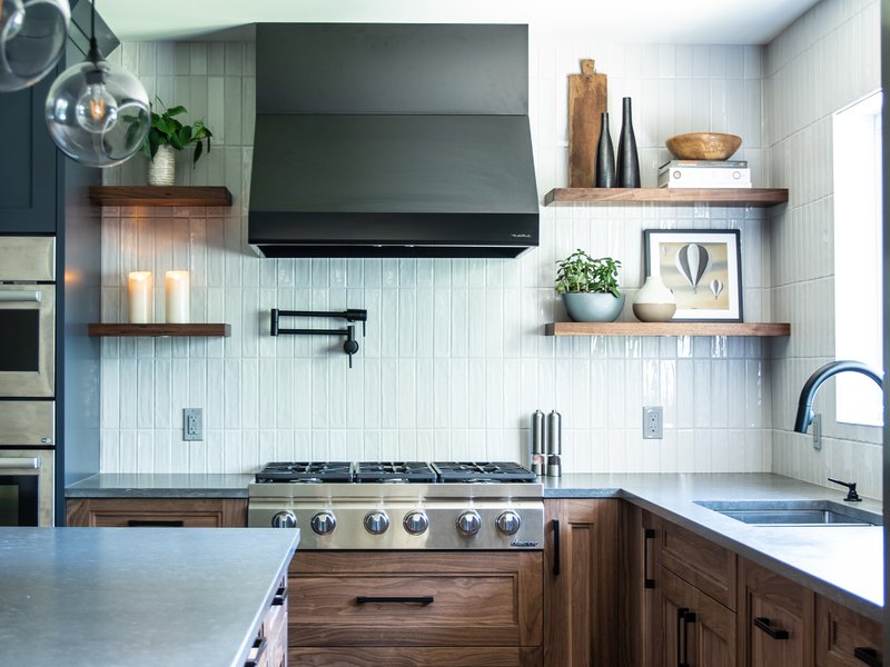
Colour: Storm
-When making your kitchen countertop selections, consider the amount of natural light you have in your space. If natural light is limited, you may want to consider lighter countertops to avoid the space feeling dark and closed off.
-Don’t be afraid to mix and match your quartz selections. A kitchen island is the perfect place to have an accent colour whether that’s going darker with your cabinets or changing up your countertops.
-Don’t get too caught up with the “trends.” The thing about trends is that they are constantly changing. It’s always better to go with something that you like, so when making your kitchen countertop selections choose something that best suits your taste and lifestyle.
-Your countertops are an investment so choose wisely-chances are they are not something you want to replace every couple of years.
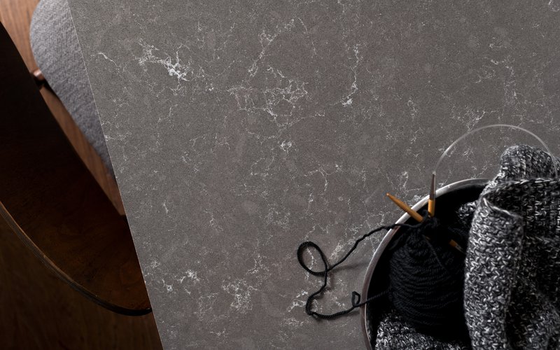
Colour Featured: Embrace
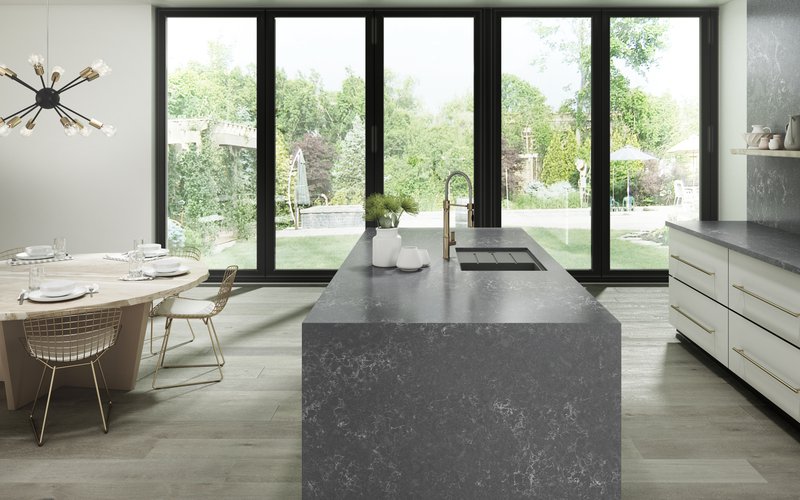
Colour Featured: Embrace
Stay in the know of interior design trends, new colours, and more!
