August 11, 2020
The Modern Magrath - QA with designer Diana Tidswell

August 11, 2020
The renovation focused largely on the kitchen and ensuite bathroom of a home that was built in the early 2000s.
Diana’s client was torn early in the process as to whether she should build a new home, or stay in the neighbourhood she loves and renovate. Once she decided to stay in the home and neighbourhood she loved – she officially brought us on board to help create the modern space of her dreams.
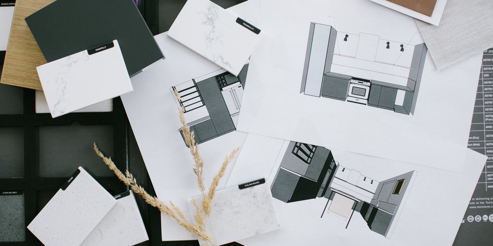
We’ve teamed up with Diana not only to help modernize this beautiful but dated home using HanStone Quartz, but to also help answer some common design questions.
Diana: There are a few ways we can create the illusion of more light and space without having to add more natural light through windows. One of the easiest and most affordable ways to instantly brighten up a room is by using paint. For this particular project, the existing colour wasn’t a dark one per say but it did have a bit of a muddy feel to it which, paired with the other darker finishes didn’t do the space any favours. In a pinch or on a budget, a coat of white or slightly off-white paint always does the trick! Another simple way is to bring in more light with new fixtures or even just brighter light bulbs! In this kitchen we created the illusion of a brighter more open space through paint, and also by removing some of the ‘bulk’ of the cabinetry. As you can see in the before photos, there were a lot of dark cabinets and by removing the majority of the upper cabinets, we created some space and ‘visual rest’ in the room, allowing the new white walls to pop and creating an overall brighter and more inviting kitchen!
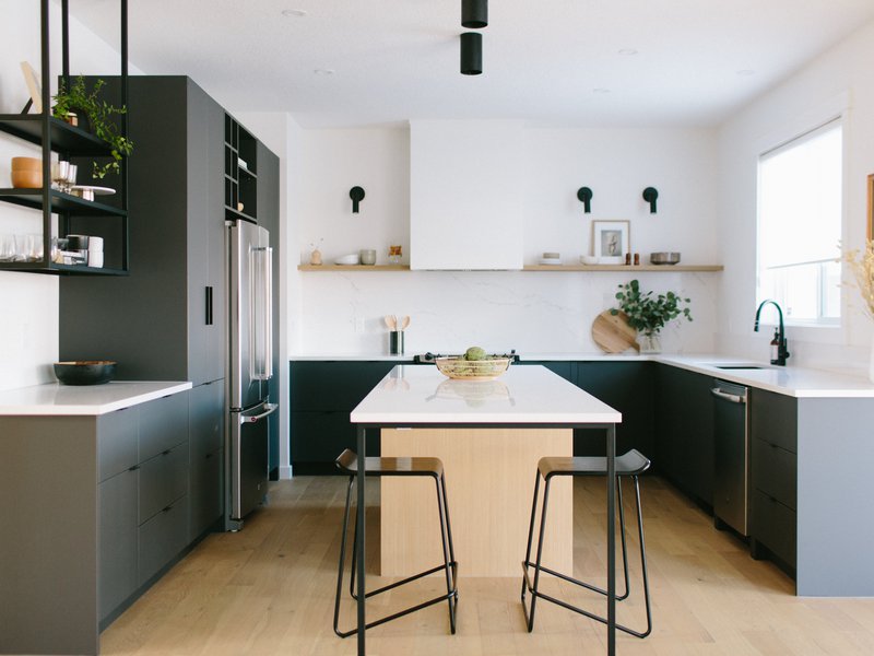
Diana: As designers it’s our job to find the right balance between form and function. For this project it was important to our client that the overall look be very minimalist and modern while still providing enough practical storage and function for her day-to-day use. This is where very detailed planning plays a very important role. In the kitchen we made sure to walk through the cabinetry layout and design in great detail, ensuring that we had enough space for all the practical needs of a kitchen. By taking out the corner pantry to modernize the room, we had to make sure to allocate for that lost storage elsewhere. This is why we used tall pantry cabinets along one wall to ensure that we maintained lots of storage. Fortunately for us our client is a minimalist so we were able to remove most of the upper cabinets in favour of open shelves that are styled with items that are used day-to-day. By keeping our millwork simple, it allowed for the standout features such as the quartz countertop from HanStone in the colour Yorkville and the custom iron work shelving to really pop!
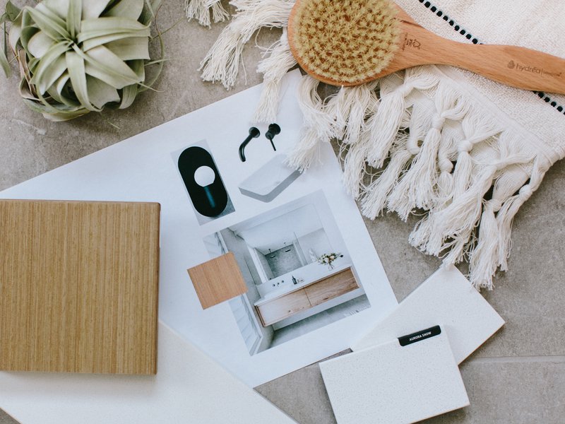
In the bathroom we had a bit of a funky configuration to work with. We had to make the most of the space by using the largest vanity possible and by adding additional storage through the use of drywalled cubbies-they look great and are also functional. Lastly, by adding a small quartz ledge above the counter in the colour Angora from HanStone, we’ve added a functional ledge for practical items that now have a better spot so they don’t clutter up the countertop!
Diana: This one was a no brainer for us. Right out of the gate we had a very clear vision for the kitchen and we wanted the ‘marble look’ without marble maintenance so we knew that quartz was going to be our material of choice. We have a few ‘go to’ favourites from HanStone for the marble look without the marble cost and upkeep so that selection was our jumping off point for the whole space which then just carried through into our material selection choice for the bathroom upstairs.
Diana: Ooh can I say everything?! haha
In the kitchen I have serious countertop/backsplash envy. I’m such a fan of running the countertop material up the backsplash and the whole back wall with the hood fan makes me swoon! Yorkville from HanStone is my personal favourite quartz colour so getting to use it in such a great application on this project was a dream! I also adore our little tube flush mount lights above the kitchen island.
In the bathroom I’m very envious of the whole vanity situation…. I love the contrast of the warm wood vanity paired with the soft Bianco Canvas HanStone countertop. And for me, adding the little ledge not only adds a very functional element to the room, but I think it’s a unique addition to the space that adds lots of character too!
Diana: If we’re talking about a full renovation (and if budget allows, of course), one of the first things we look at when planning a bathroom is the overall layout. It can be easy to get ‘stuck’ thinking about your space only in the way it’s currently shown, but if you pull back and look at the overall footprint without the existing elements, you can sometimes find ways to switch up the layout or orientation of a room to maximize the space and make the most out of the bathroom. In this space we did just that, there was an awkward corner vanity, a lot of wasted space with the built-in tub and a shower that was too small. By reconfiguring the layout slightly, we could increase the functional use of the room as well as allow the space to feel more open than it did before.
If a full renovation isn’t in the budget, a small investment in some organizational products can really go a long way. We’re big fans of making the most of your space through organization. A good Marie Kondo-ing of your products is always a great place to start, and then make sure that everything has its place. Whether you prefer baskets, organizing trays or little containers, find an organizational system that works for you and stick with it! Most of our projects are not overly large spaces and it’s always our biggest compliment when clients come back to us saying that their rooms are not only beautiful, but more organized and efficient too. Trust us, it can be done!
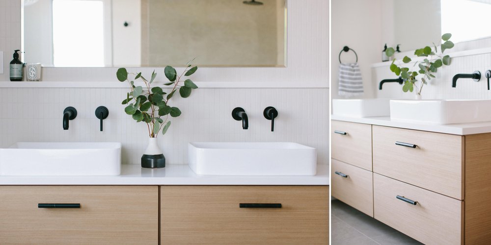
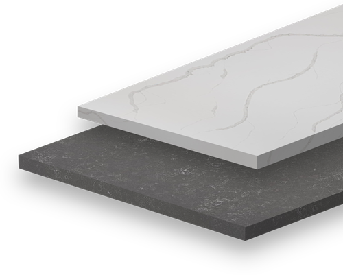
Colour Featured: Bianco Canvas
Diana is an interor designer, blogger, and partner at Kresswell Interiors based in Edmonton, Alberta. Diana has spent the last 10 years in the design industry working in residential and commercial interior design and project management. Diana started her blog 204 Park as a way to document her love for lifestyle and design and has been able to turn that passion into a creative career she loves. Her design style leans towards eclectic contemporary with a heavy mid century modern influence.
Stay in the know of interior design trends, new colours, and more!